Email
hello@point.studio
Location
London, Dubai


01. Project introduction
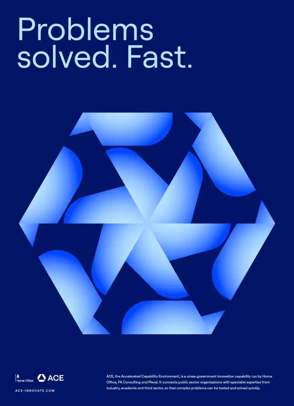
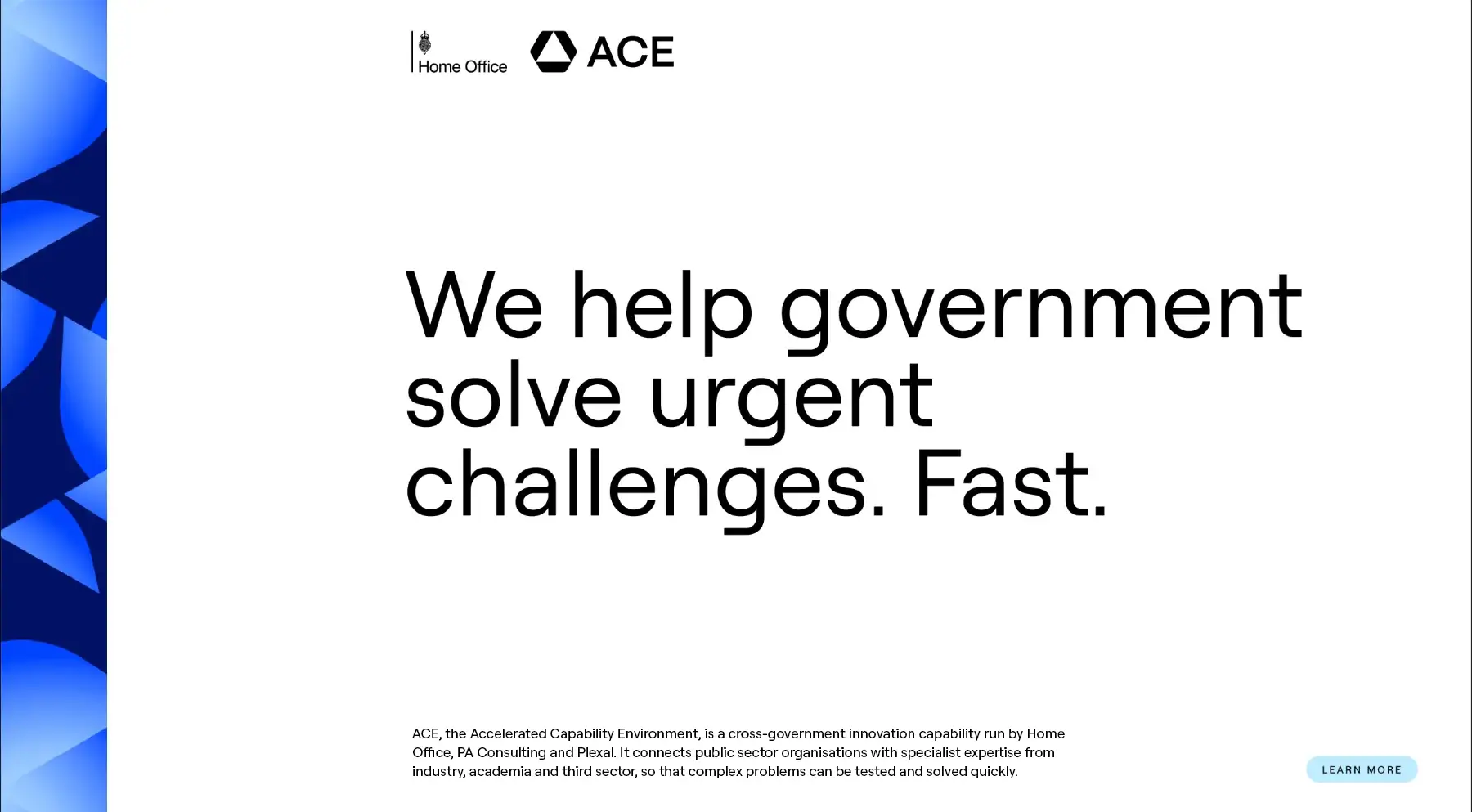
ACE, the Accelerated Capability Environment, is a cross-government innovation capability run by Home Office, PA Consulting and Plexal. It connects public sector organisations with specialist expertise from industry, academia and third sector, so that complex problems can be tested and solved quickly.
We worked with ACE on a new brand identity: one with the credibility expected of a government organisation, and the energy of a team whose job is to find new ways of doing things.
01 One piece of artwork, seen through a triangle
02 Repeated six times around a centre
Drag the triangle
02. The idea
What sets ACE apart is its ability to find and assemble the right mix of people, technology and expertise for each problem. The parts are not new each time. What changes is how they are combined.
A kaleidoscope works the same way. A handful of simple elements, turned and repeated, produce a pattern that none of them could make alone. Move them and a new pattern appears. That became the idea behind the identity: many different parts, one collective purpose, endless possibilities.
03. The symbol
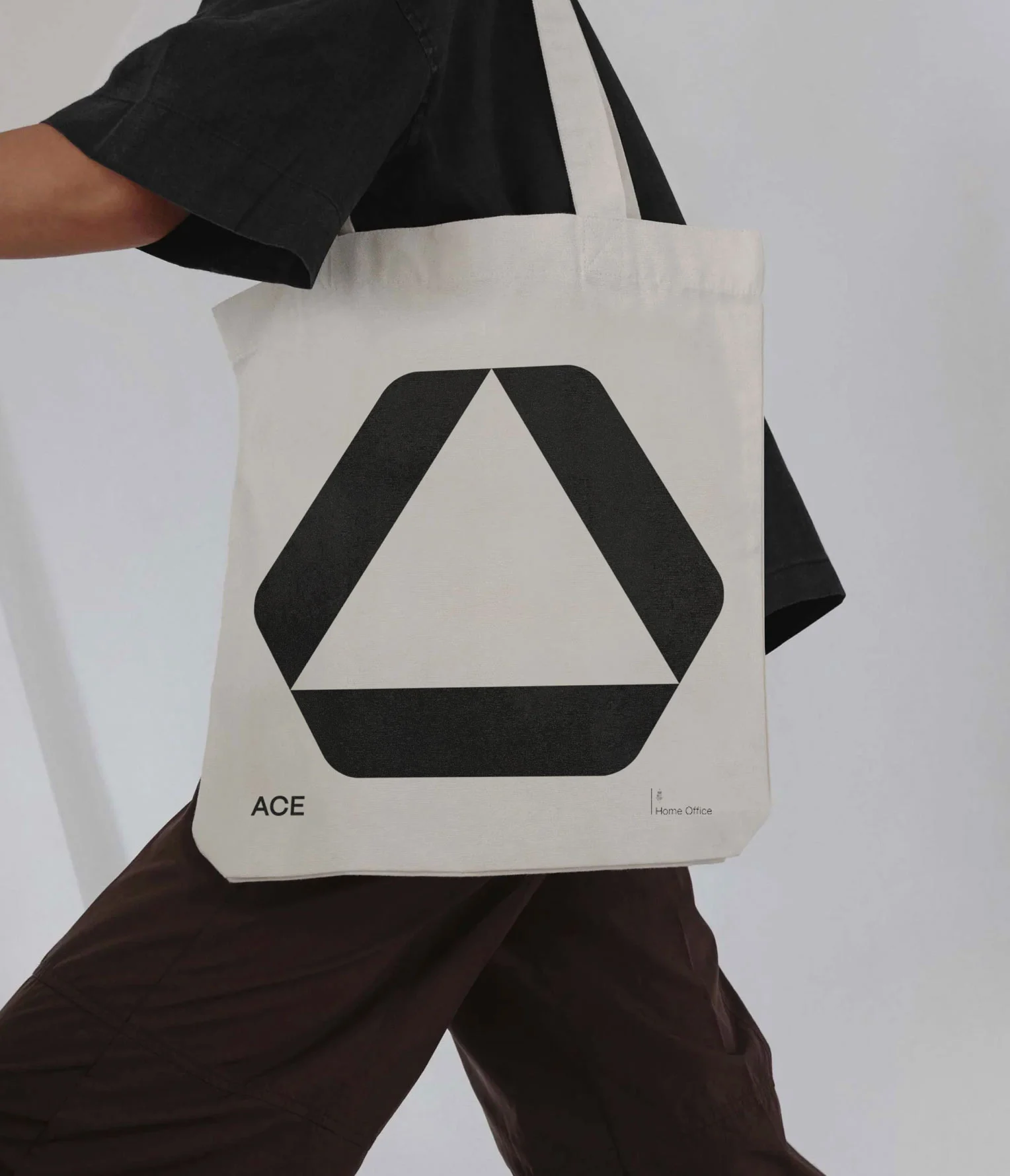
The symbol is drawn on the same triangular grid as the kaleidoscope. Three identical shapes turn around a centre and meet to form a hexagon, leaving a triangle in the middle that reads as the A of ACE.
Drag the pattern
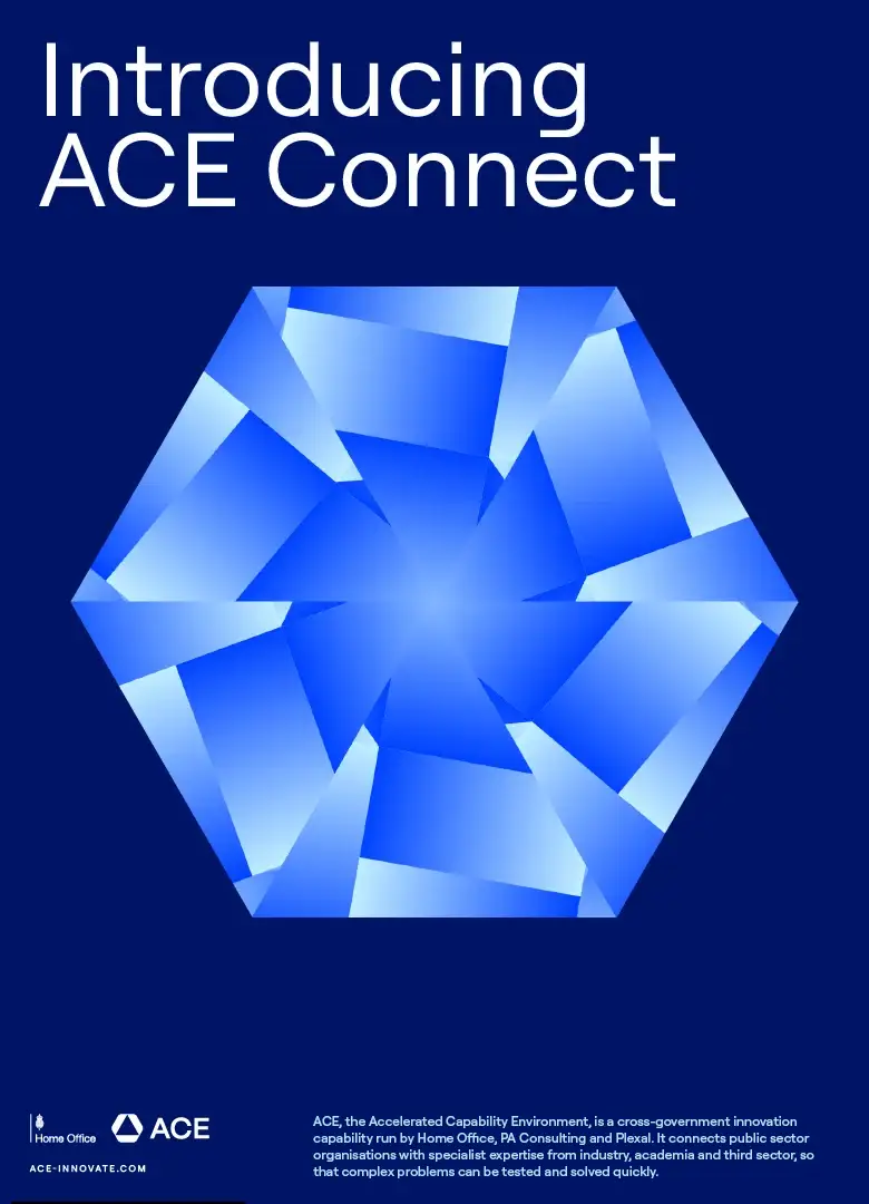
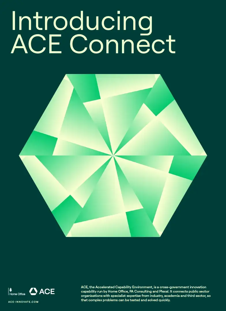
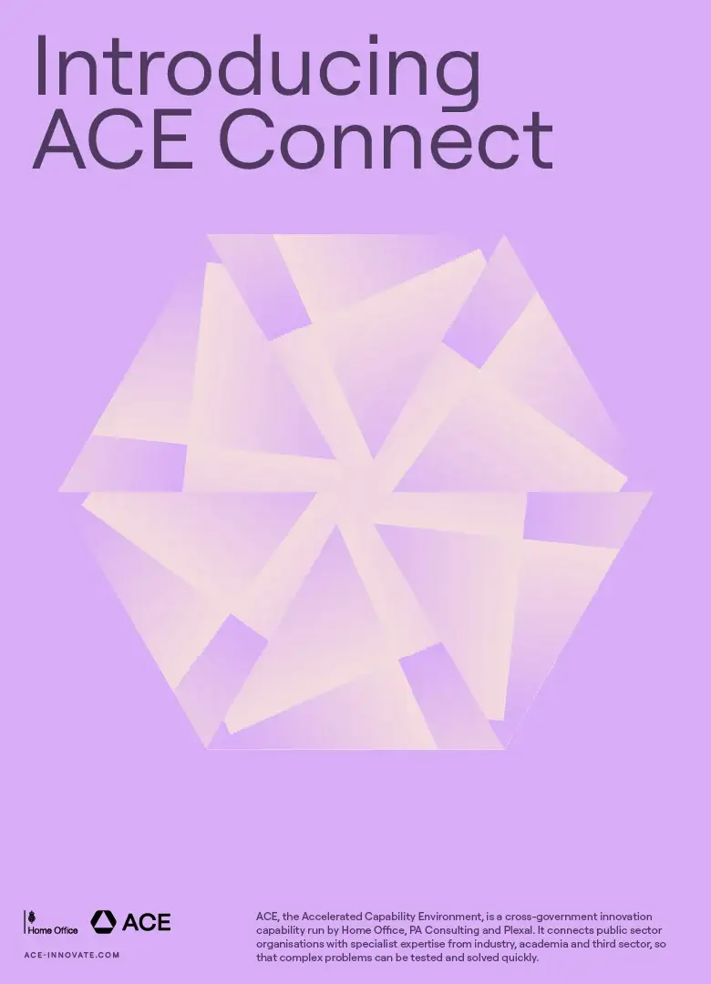
04. The kaleidoscope
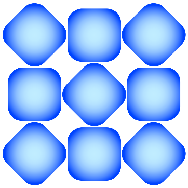
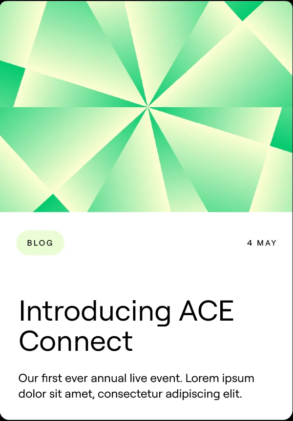
The kaleidoscope is made rather than drawn. One piece of artwork is seen through a triangle, and the triangle is repeated six times to make a hexagon. Changing the scale, angle or position of the artwork gives a new result every time.
We built this into an online tool for the ACE team, with twelve colour styles across the three brand families. Anyone can make a new on-brand graphic in seconds, as a still or as an animation, and reuse it later from a short code.
05. Visual language
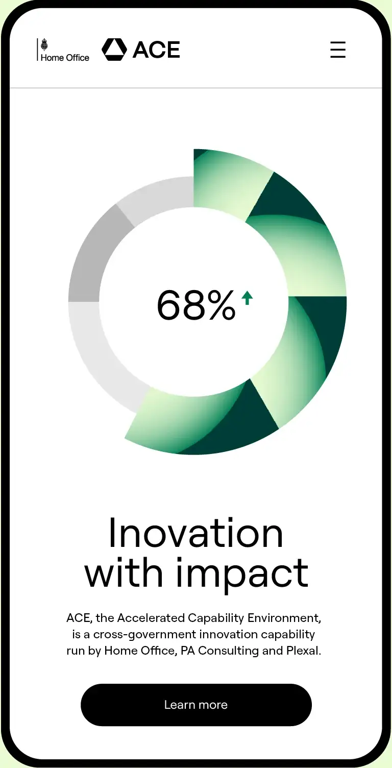
The palette has nine colours in three families: purple, blue and green. Gradients are only ever made within a family, which keeps the colour rich and the system simple to use.
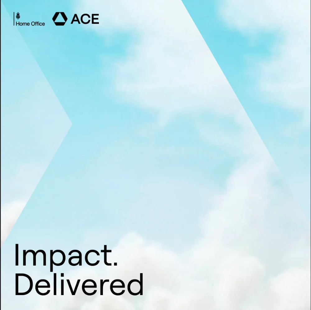
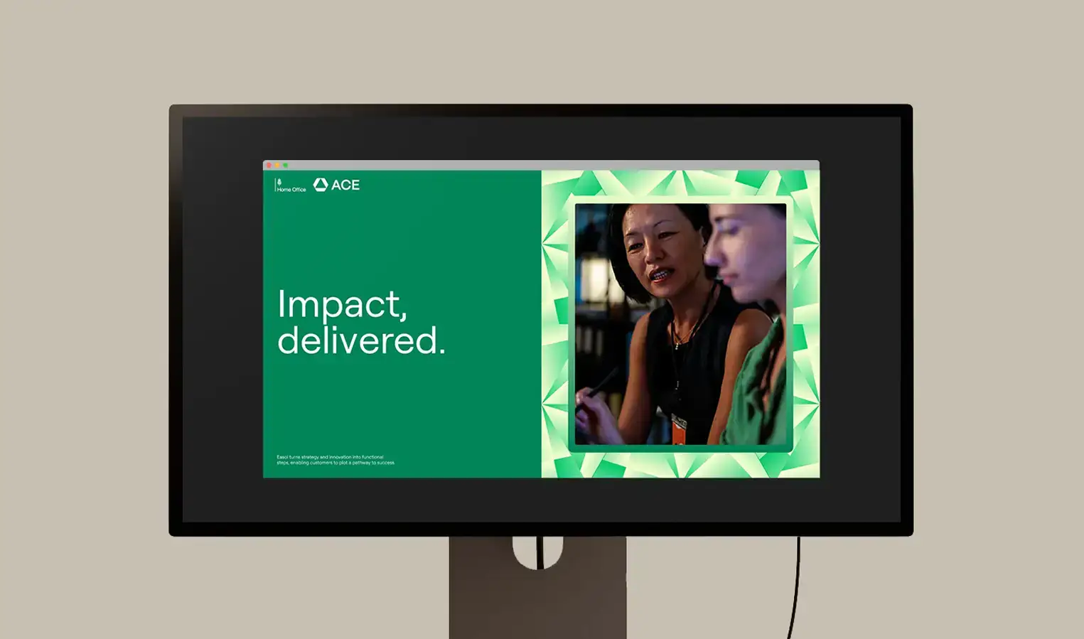
Photography is given the same treatment as the graphics. Angular sections of an image are shifted and enlarged, as if seen through cut glass. Around all of this, clean typography and plenty of white space keep the tone clear and credible.

06. In use
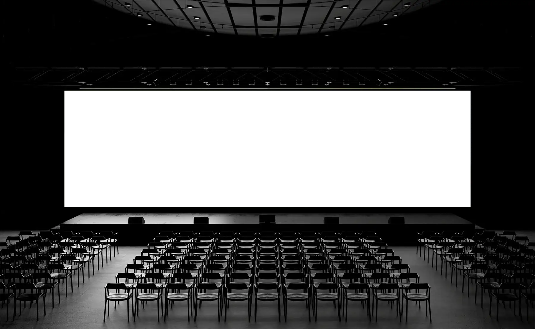
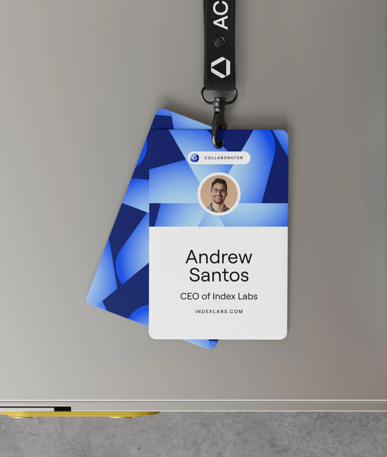
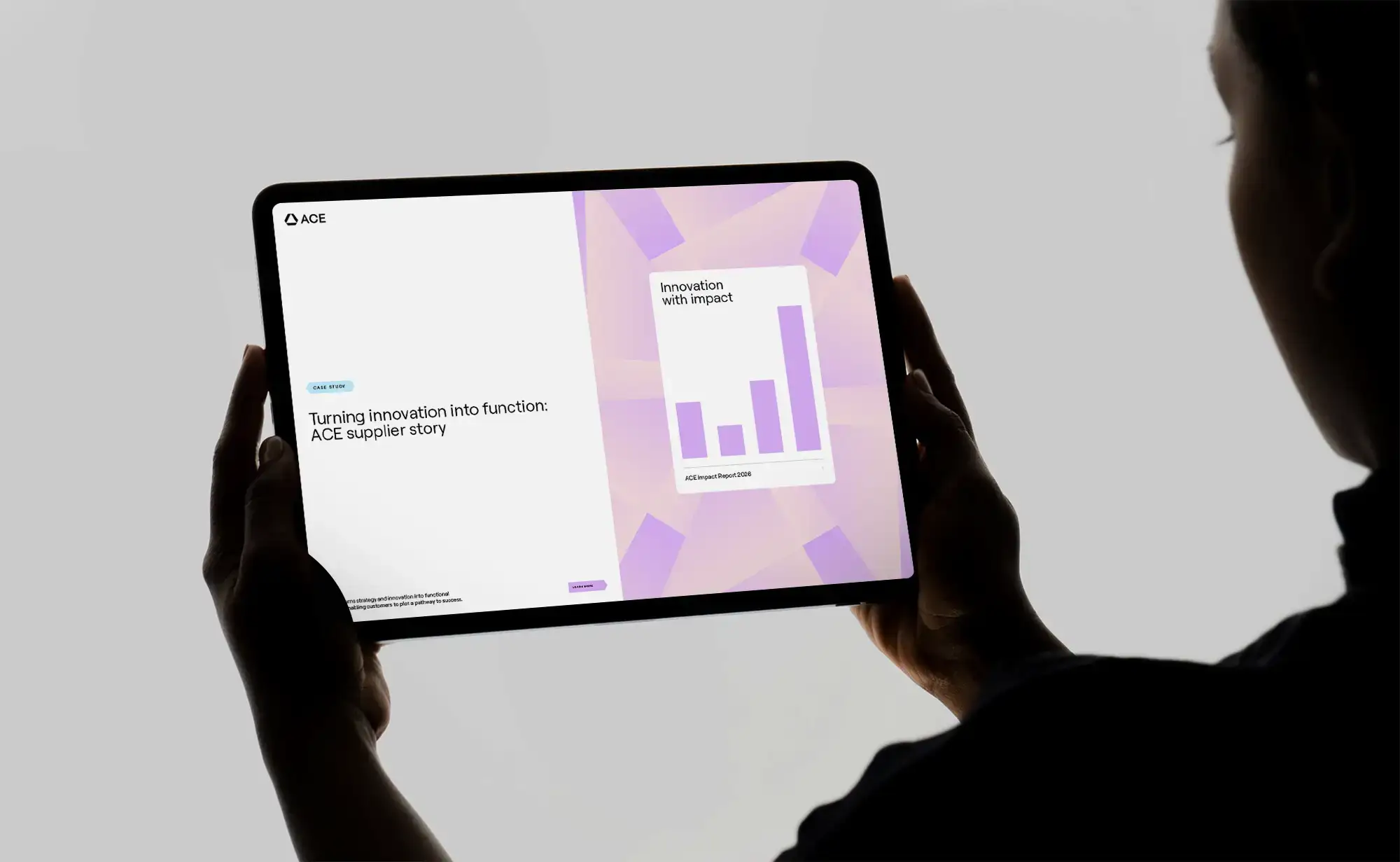
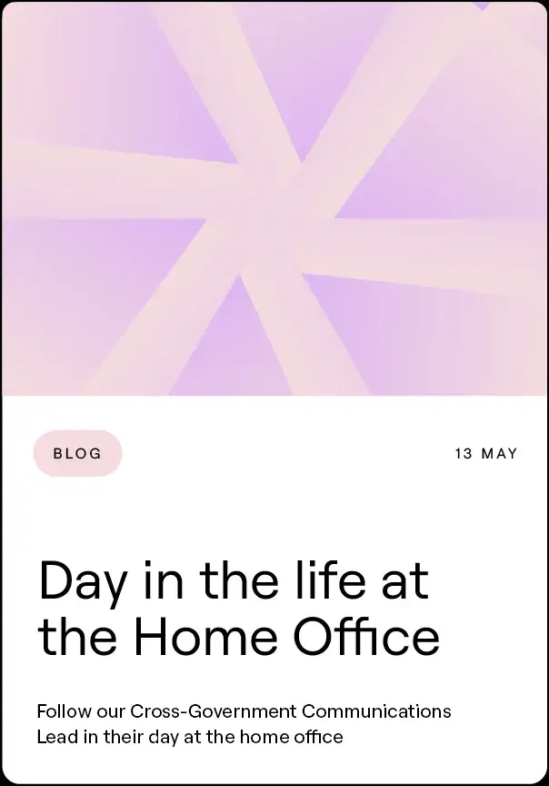
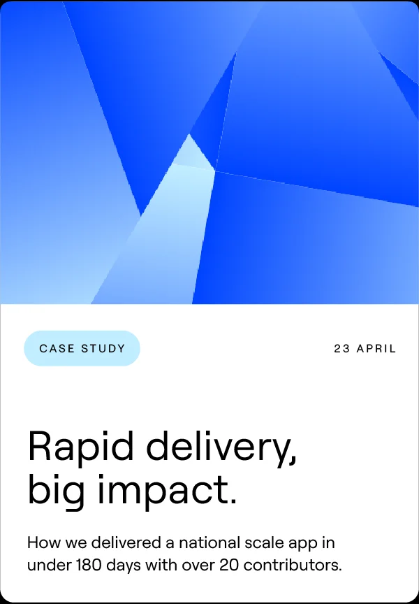
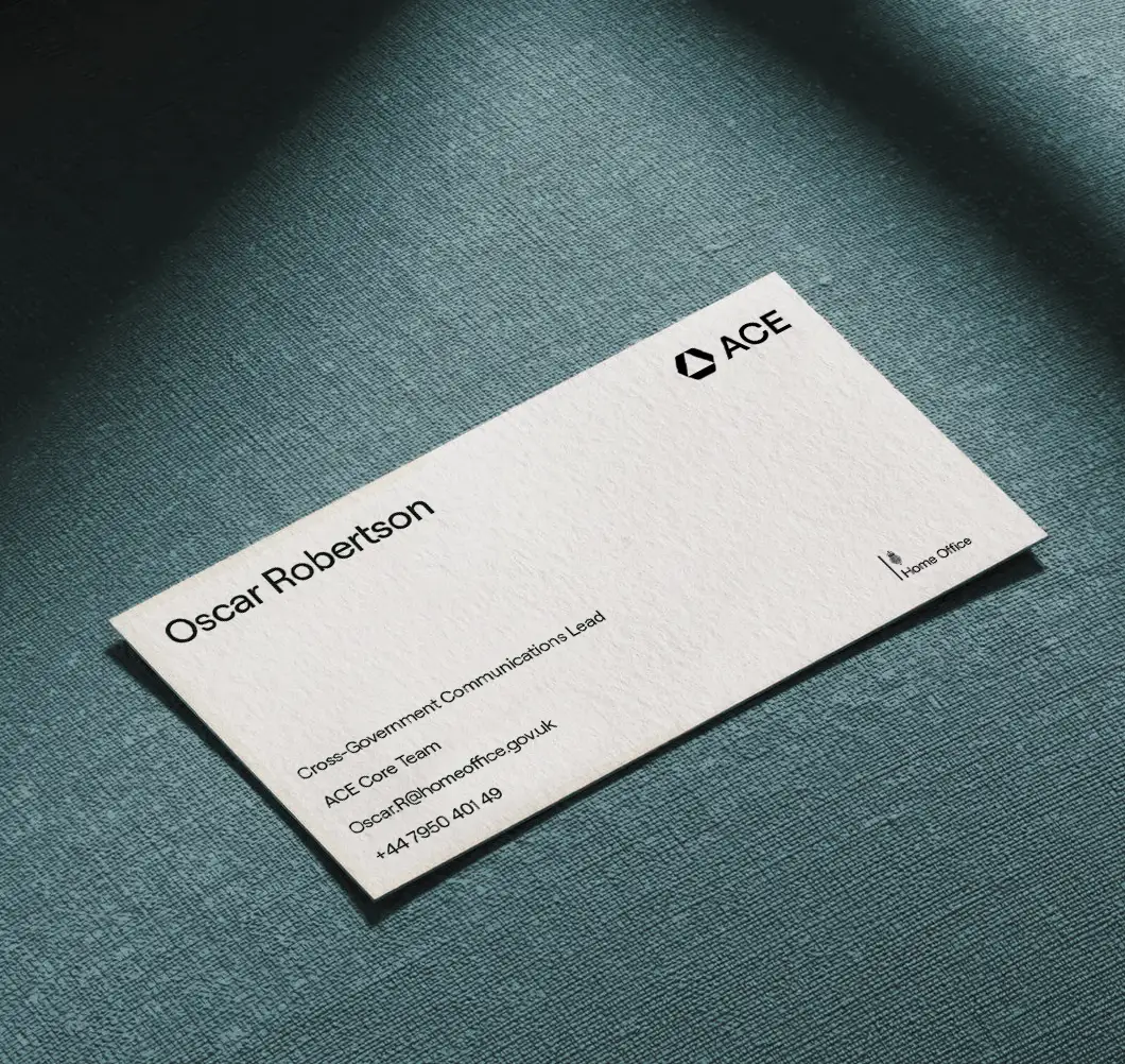
The identity was designed to work everywhere ACE appears: websites, reports and presentations, events, stationery and motion. The kaleidoscope can fill a stage screen or sit quietly as a strip down the edge of a page.
An online brand hub brings the guidelines, logos, icons and tools together in one place, so the ACE team can keep building the brand themselves.